Appier Design System Redesign
Streamlined all components across variant products
Appier is a SaaS company in unicorn status that offers AI-driven products and services to help companies help companies with various aspects of their operations, including advertising, customer engagement, and data analysis.
Role
UI Design / Research
Timeline
Apr - Dec 2021
Co-work with
UI Designer / UX Designer
me
My Role
As a UX designer with visual design background, I built the design system for following perspectives:
01 Problem definition & desk research
Researched design systems from competitors, and defined an appropriate design system skeleton for Appier.
02 Restructure components library
Organized the existing components as a component library with a clear structure, to immediately enhance the efficiency of collaboration within the design team.
03 Icon design & Guideline definition
Rebuilt the icon system and defined the design guidelines for icon creation.
Influence
Time savings ranging from 20% to 50% for product development
It's challenging to provide a specific average, some reports suggest that companies with well-implemented design systems can achieve time savings ranging from 20% to 50% in various aspects of the product development lifecycle.
Built common visual language across product teams through regular updates
To ensure our new design system stays consistently up-to-date, each UI designer is assigned as the owner for specific components.
We hold two regular meetings to discuss design internally and assess implementation feasibility with front-end colleagues. These updates help us stay synchronized on any design changes and spec details.
Problems
Appier’s products have different development teams and a list of common components to use has not been set, so they have used their component libraries so far. However, this leads to extreme inconsistency across the product lines, and difficulty combining the products into one console together.
Key pain points
Lack of Product Identity
Lack of Consistency
Lower recognition
Non-reusable components
Can’t speed up the development process
Goal & Milestones
UI/UX team decided to reconstruct a new design system across the product lines, to help both designers and multiple development teams share a common design resource.
According to desk research, the establishment of a design system can greatly reduce the cost development-wise, and facilitate better focus on the innovation of product functions.
To achieve the goal, we divided 4 stages to adopt the new design system step by step:
Reorganized the existing design system
Revamping from fundamentals to components
Followed the new features on the product roadmap to establish new components
Keep iterating the design system consistently
How might we
How might we accelerate the working process and innovation by building a design system?
Structure of system thinking
The design system was a key element to streamline the design+dev process, as the product was built with distributed and cross-functional teams. A single source of truth, building bridges and encouraging collaboration.
01
Style fundamentals
Appier Design System 2.0 was created to provide centralized and consistent standards of visual language.
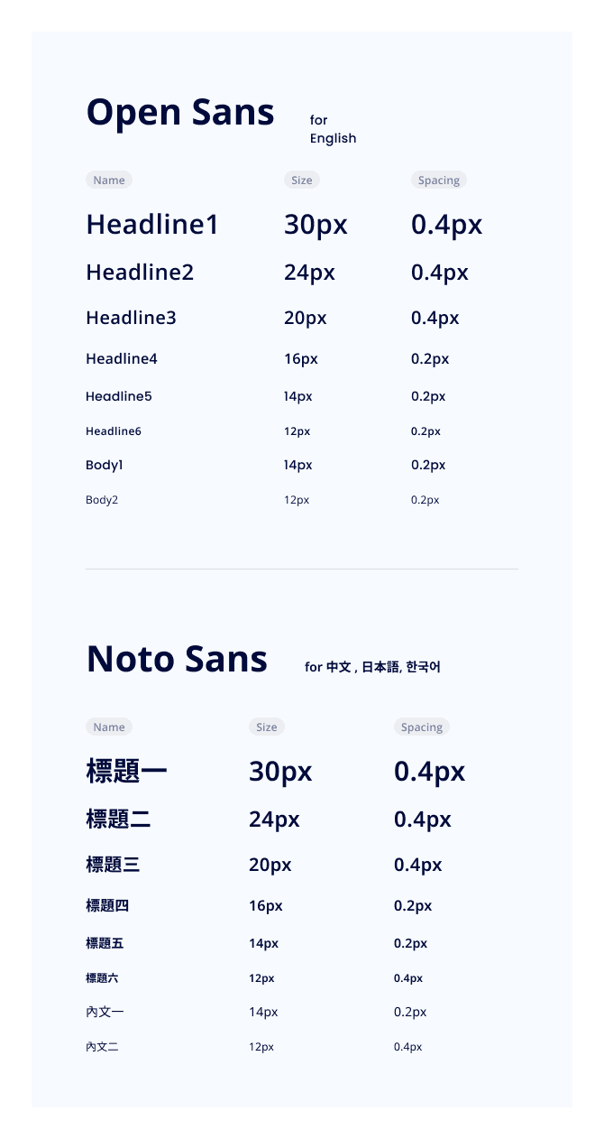
Typography
We used “Open Sans” as the default font for English, and used “Noto Sans” for Chinese, Japanese, and Korean. It’s common for commercial use.
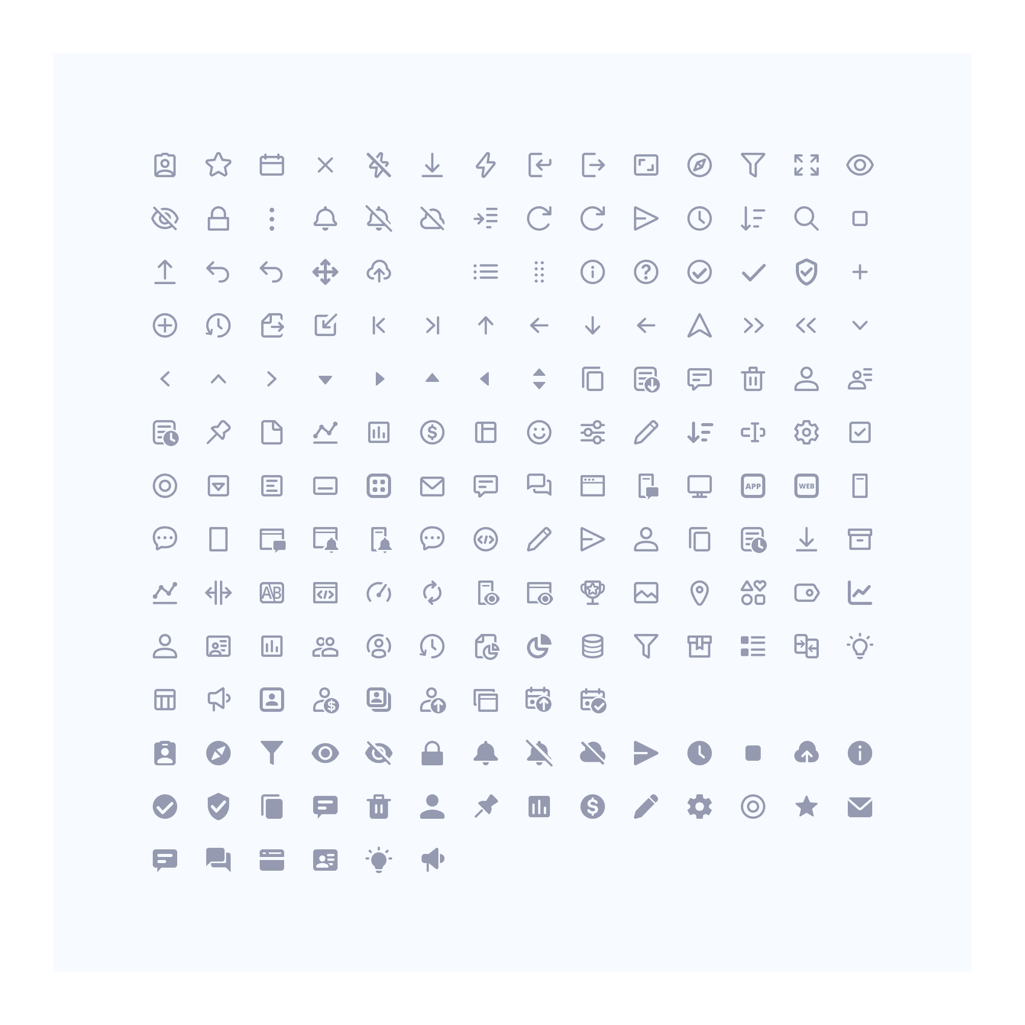
Iconography
We aligned the inconsistent icon styles to outlined as the primary style and set 20px as the primary icon size based on the 14px line-height of the font size.
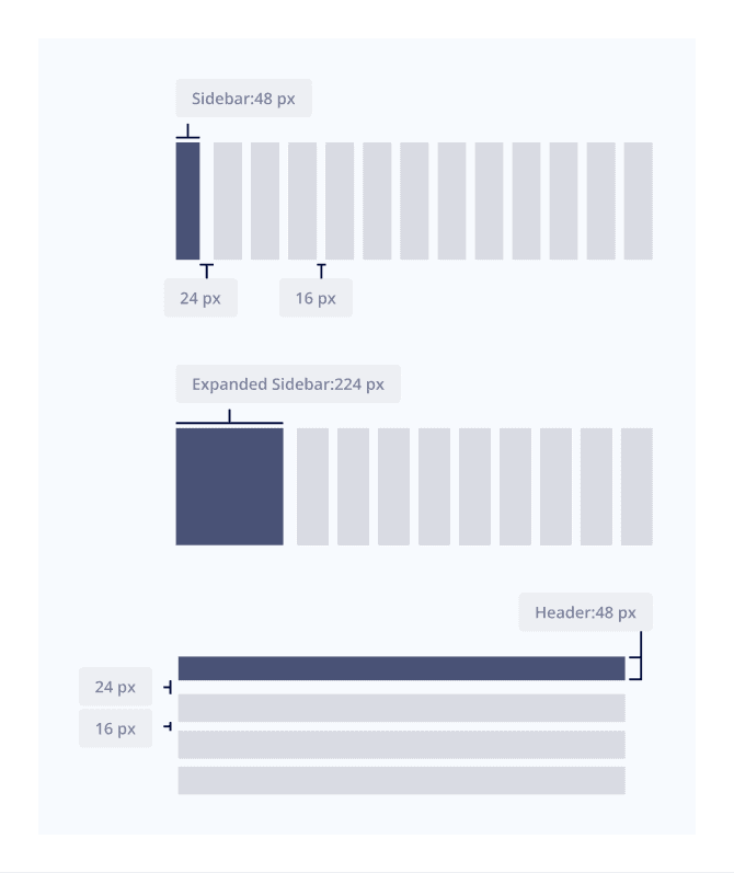
Grid System
Our products are mainly used on PC only, so we set the grid system for it, which is also 4px-based.
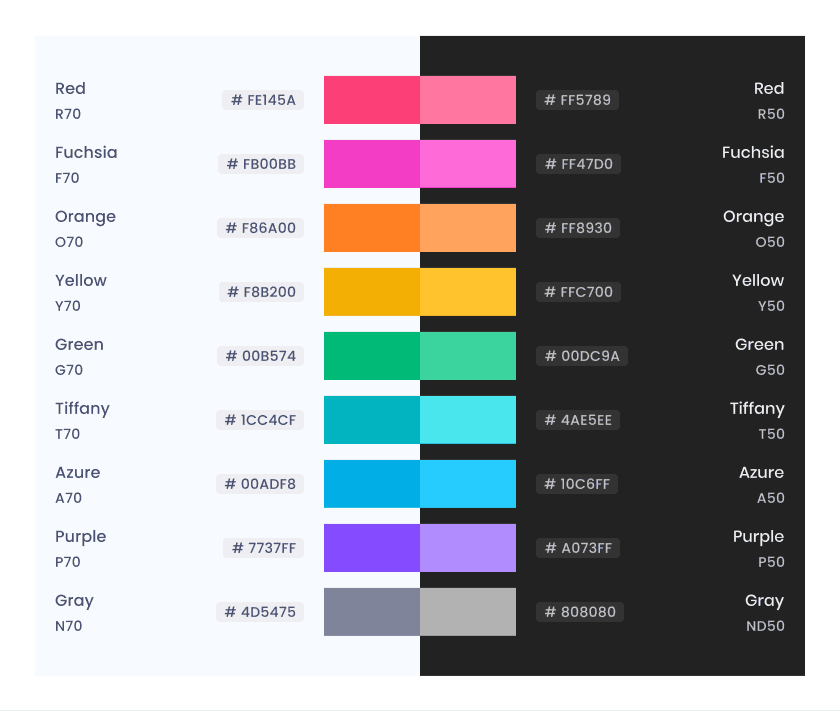
Color System
We set the primary corporate identity color for our product as blue. The color system is separated into its own usage. Our products also have theming choices for users, so the color will be contrasting to ensure the consistency of usability.
Background
Use for the base color, panel background.
Overlay
Use for the background of interfaces with statuses, or dialog which needs a mask.

Content
Mainly used for wording and icons.
Blue
Mainly used for primary buttons and selected statuses.

Semantic
Mainly used for suggestion statuses, charts, data, or properties.
02
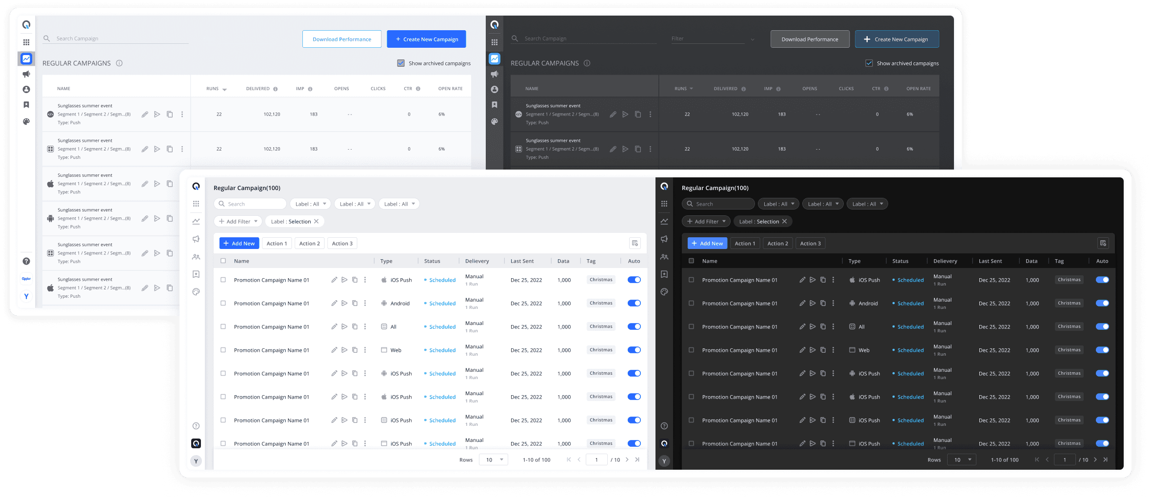
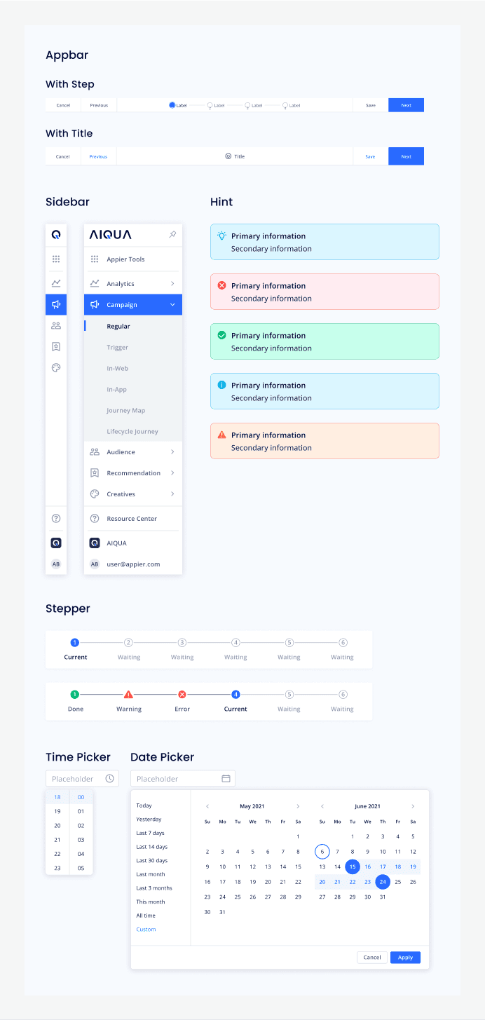
UI Components
Bringing the design process closer to the development process was a game-changer in order to maintain consistency.
The system was crafted following the Atomic Design principles and Sass (CSS) conventions such as - Don’t Repeat Yourself (DRY), Make it modular, Avoid conflicts & Think generically.
Elements to Components
Based on a desire to arrange the layout efficiently, we also resized the components with appropriate readability.
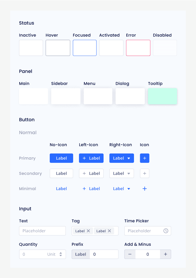
Molecules
We mainly developed the module by features, and according to usage scenarios to define its style.
03
The surface
The interface was assembled with elements placed in an external UI library called Storybook.
Designers also manage page templates by application on Figma, which enabled us to create a fast, scalable, and collaborative workflow, for both designers and engineers.


04
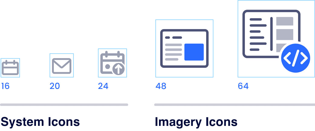
Icon Design Guideline
Iconography is the most complex part to keep it consistent, so we established a specific guideline to ensure UI designers could keep making the icon styles as similar as possible in the future. Here are some dimensions we defined the rules:
Style
Set the icon style into two styles to ensure some of the icons can be used in different statuses, but mainly use outlined as the primary style.

Size
The icons are separated into two types according to size. System icons used for action, content, and status. Imagery icons used to express complicated scenarios or empty states.
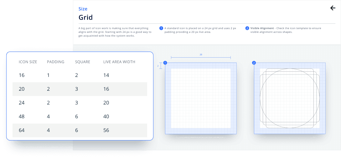
Grid
Strokes

Corner radius

Modifier sizes

Key takeaway
Keep improving developing progress
Reimporting a new design system to the product is a big challenge to assigning resources to the development team. Regarding the concern, we discussed with the dev team frequently to find an appropriate solution to improve the efficiency of importing the design system.
A design system is generated from internal requirements
During the research stage, we found that big companies have different concerns when building a design system. Therefore, except for consistency, we want to focus on enhancing the product's usability, that's the reason why we evaluate the contrast, recognition, and information sent by interfaces.
Speaking the common language
The benefits that a design system brings to our workflow are countless. One of my favorite pros is that having a common product language promoted collaboration and avoided misunderstandings in our cross-functional teams.